Current Experience
We mapped the existing experiences of a person considering therapy and a person already attending. This helped us identify emotional barriers, moments of uncertainty, and opportunities for support.
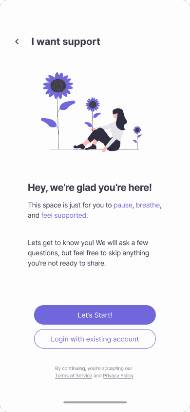
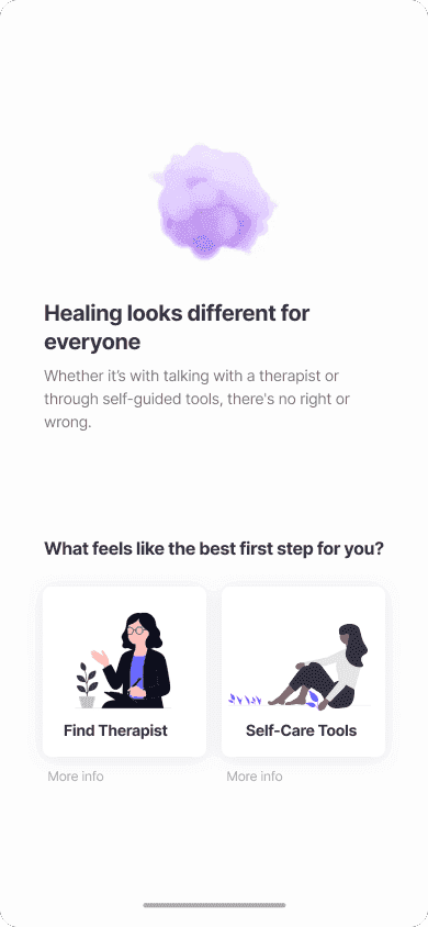
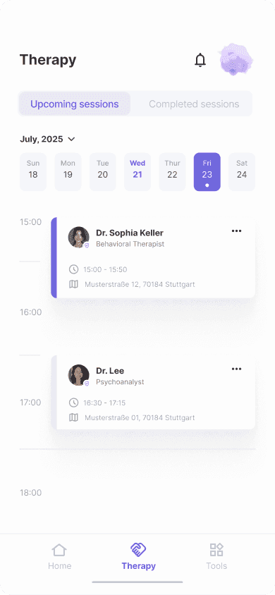
An app that supports both clients and therapists from first steps to ongoing care.
The goal of this project was to address the challenges of starting and maintaining therapy by designing a mental health app that supports both patients and therapists. The focus was on reducing emotional barriers, simplifying processes, and creating a more connected and supportive experience.
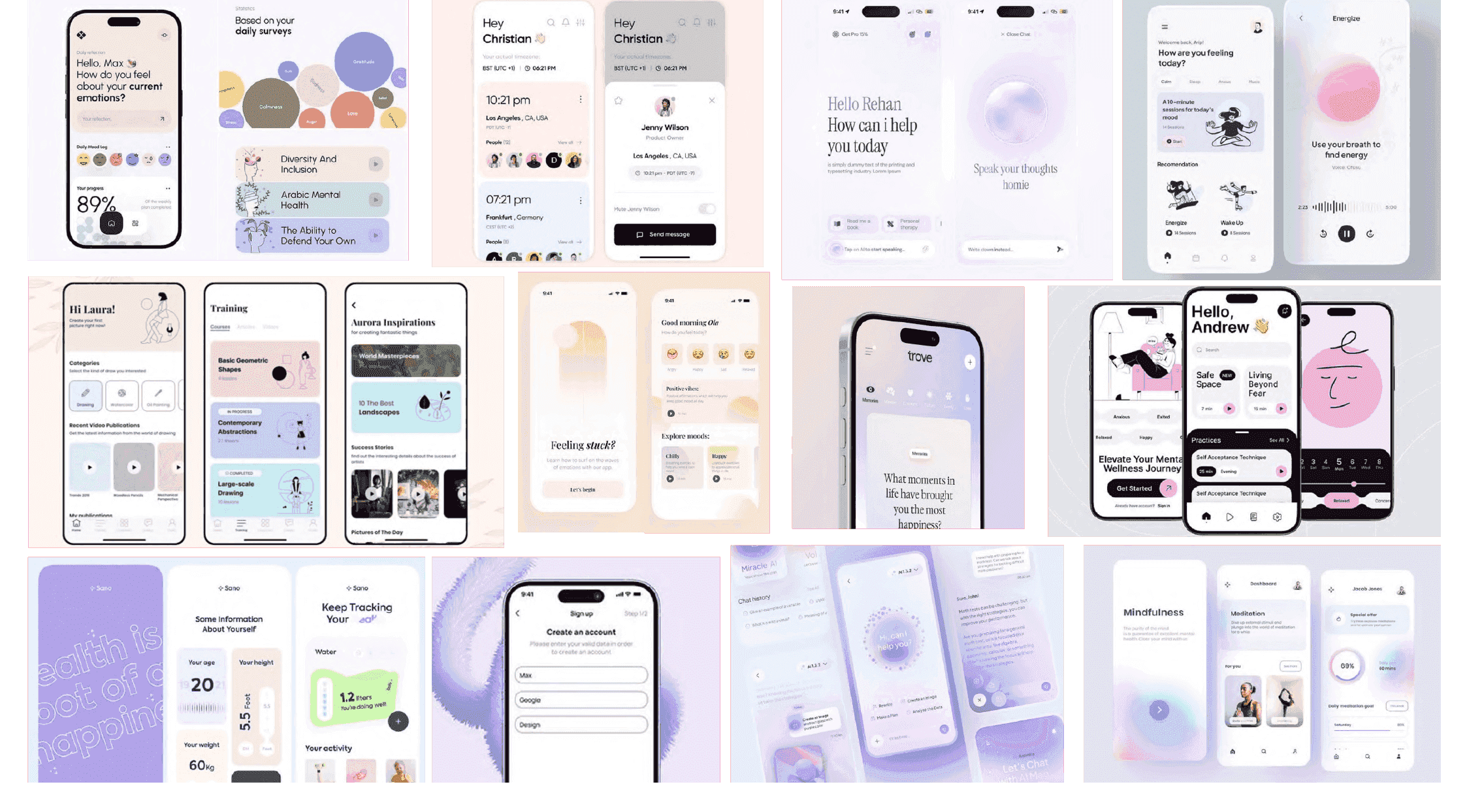
To better understand the existing mental health app landscape, we conducted a competitive analysis of platforms such as MindDoc, Sanvello, and Reflectly. These insights helped us shape a design approach that focuses more strongly on emotional support, reflection, and accessible long-term guidance.


We mapped the existing experiences of a person considering therapy and a person already attending. This helped us identify emotional barriers, moments of uncertainty, and opportunities for support.
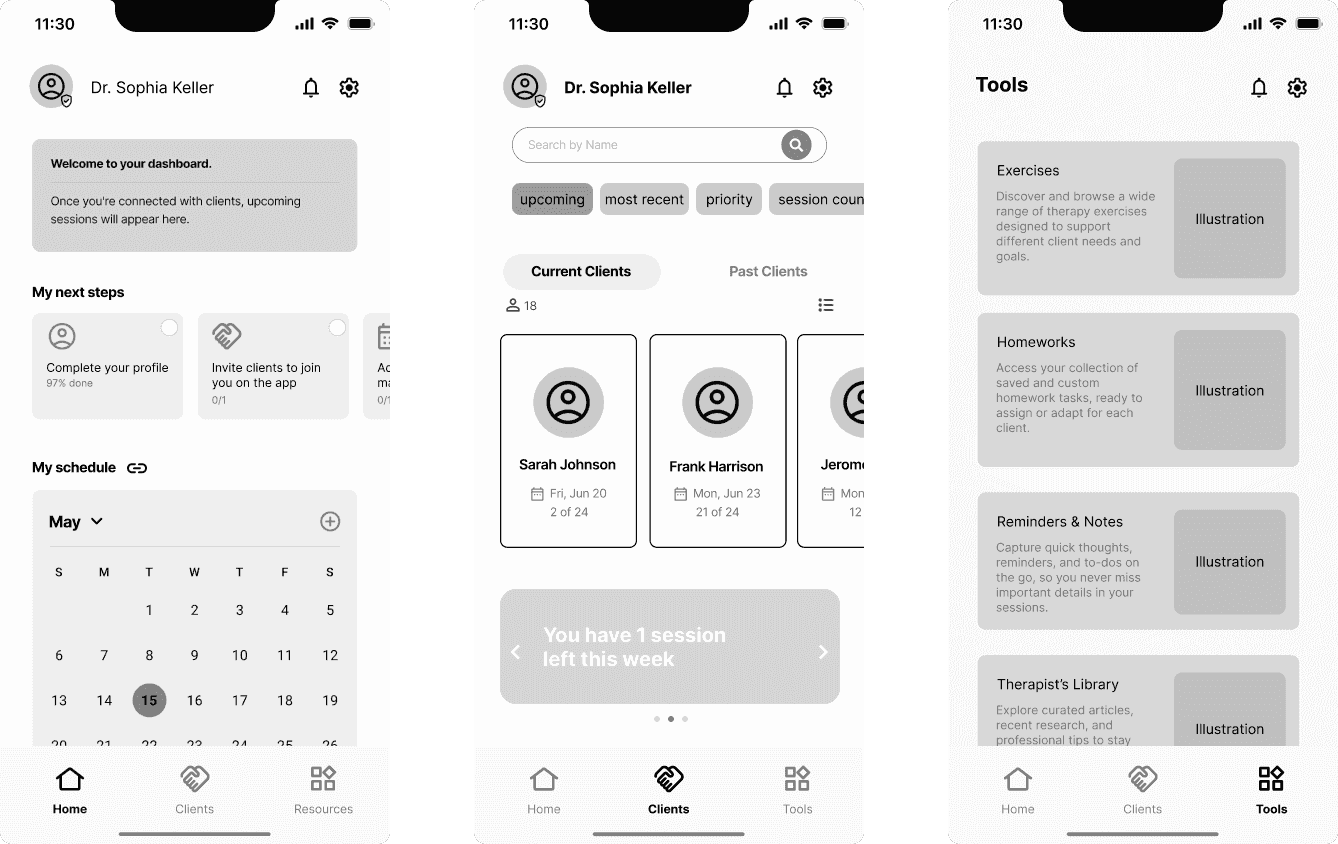
This case study can be explored from both the client and therapist perspective. By understanding the emotional needs, workflows, and challenges of both sides, we were able to create a more balanced and realistic therapeutic experience.

27 | Hamburg | Freelance Graphic Designer
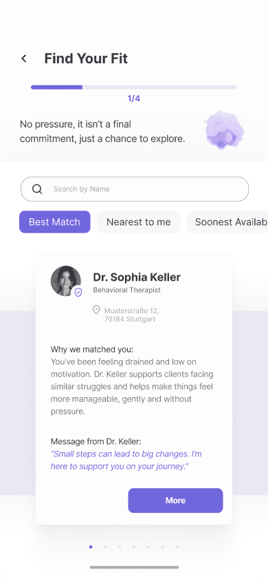
To test our initial ideas, we designed low-fidelity wireframes covering the core journeys of both users and therapists. We presented the concepts to a licensed therapist, whose feedback helped us identify unrealistic assumptions, validate promising ideas, and uncover new opportunities for improvement.
These conversations helped us challenge assumptions, identify practical limitations, and refine the experience for both clients and therapists.

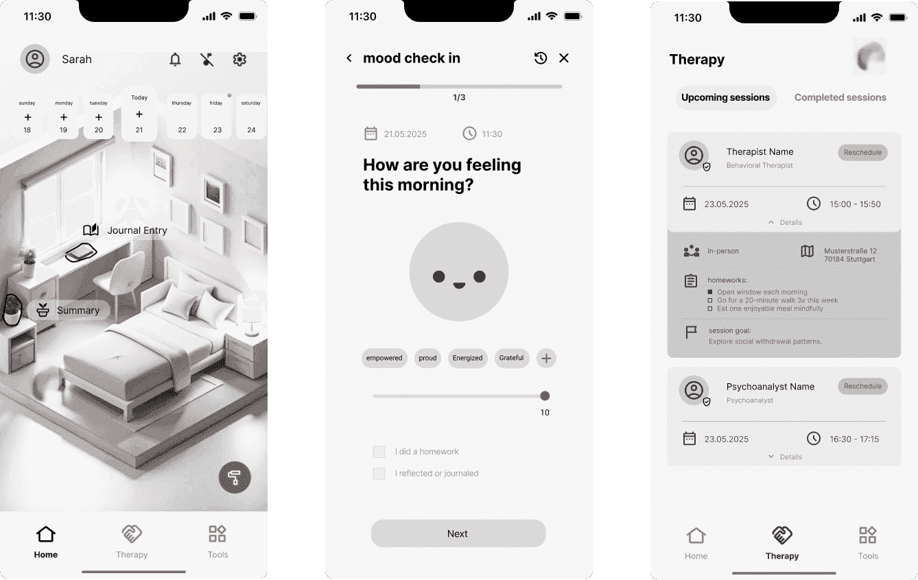
Patients need to feel in control of their therapy. Excessive therapist involvement outside sessions can blur boundaries and create dependency.

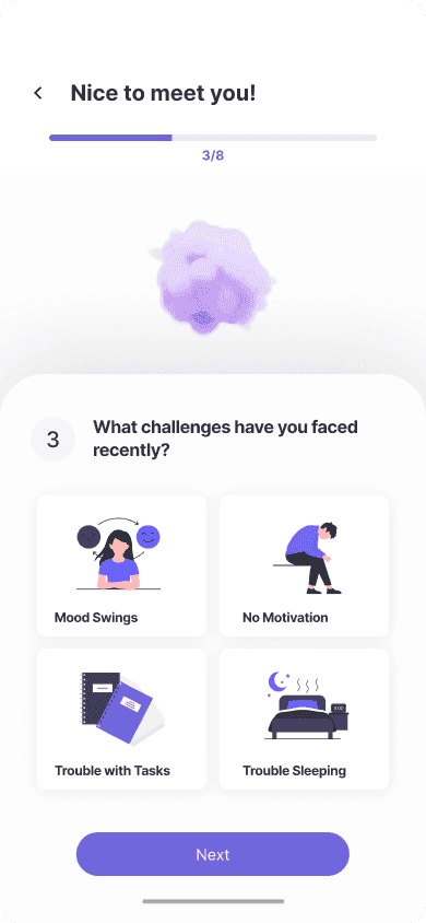
Early concepts required too many steps and decisions. Feedback highlighted the importance of minimizing effort and cognitive load throughout the experience.

Users engage more when they understand what data is shared and can decide what remains private.
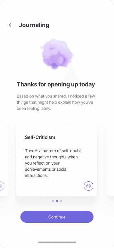
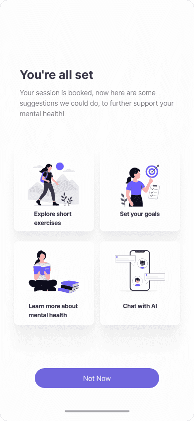
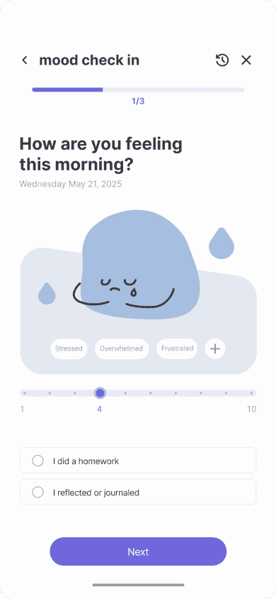
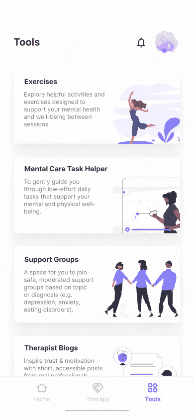
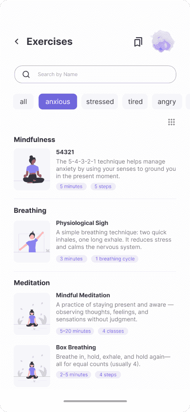
Behavioral therapy relies on activities, homework, and reflection between appointments, not just during sessions.
Patients need to feel in control of their therapy. Excessive therapist involvement outside sessions can blur boundaries and create dependency.
After receiving valuable feedback from the therapist and our professor, we refined the concept and developed mid-fidelity wireframes.
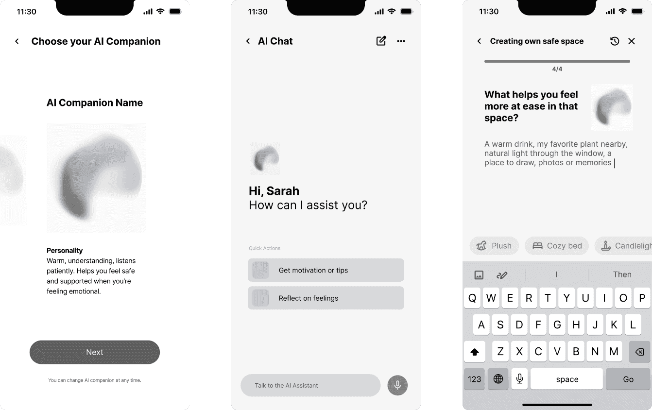
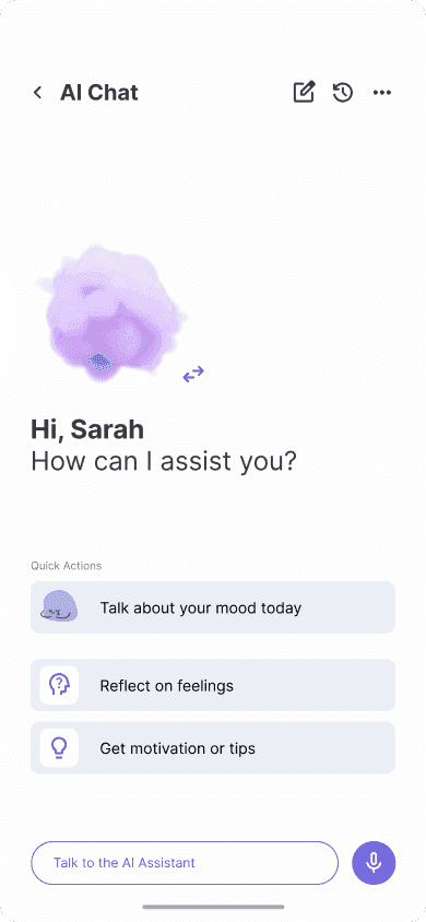
AI support (client)
Since SideBy serves both clients and therapists, we explored two visual identities within one shared system. Purple communicates warmth, reflection, and emotional support, while blue represents trust, structure, and professional care. These references helped shape the tone and color palette of the final design.
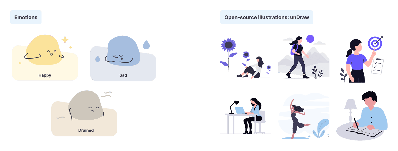
Mental health can be difficult to talk about, so we used illustrations to make the experience feel more accessible and human. Together, the custom assets and open-source help communicate emotions in a simple and approachable way.
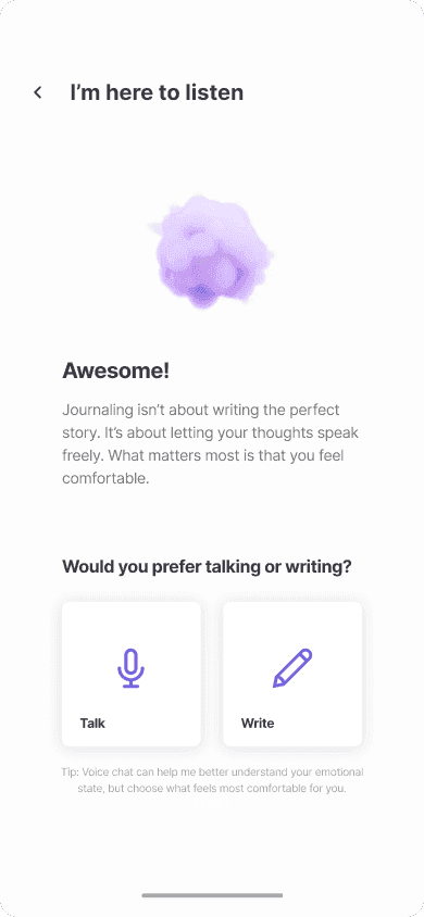
Because emotional support is not one-size-fits-all, it was important to me that users could choose the type of guidance that feels most comfortable to them.
I designed and animated three AI companions, each with a distinct personality and communication style, creating a more personal and approachable experience during challenging moments.
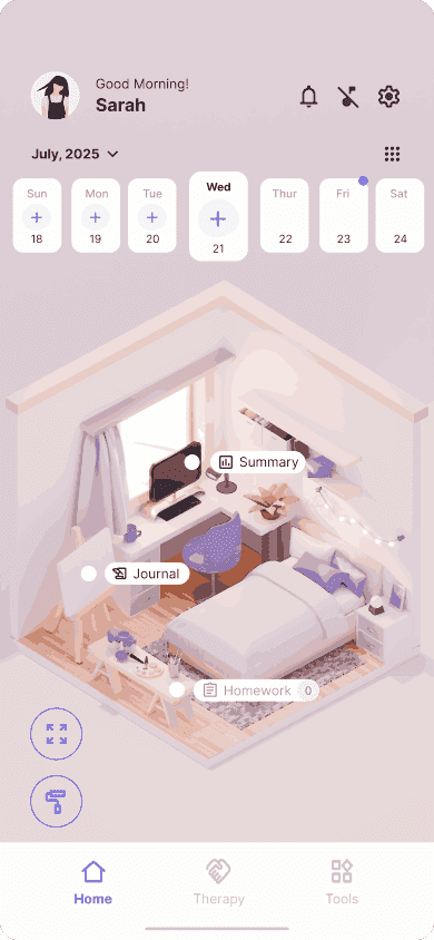
The Safe Space is a personalized environment designed to make the app feel more welcoming and emotionally supportive. Based on users' preferences, the space can reflect different atmospheres and visual styles.
The environment also adapts to the time of day, creating a stronger connection between the digital space and the user's daily routine.
For SideBy, we created two connected color systems for the client and therapist experience. The client palette feels calm and supportive, while the therapist palette adds a clearer sense of structure and professional trust.
Primary Purple
#7067DCSecondary Purple
#E9E8F5Background
#FDFDFDSurface
#F5F6FAText Primary
#3A3943Text Secondary
#7D7D7DWe used Inter for its clarity, accessibility, and versatility across both client and therapist experiences. Different weights establish hierarchy while maintaining a cohesive visual language.
Aa
Aa
Aa
Aa
The SideBy logo symbolizes the connection between clients and therapists through two intertwined figures, reflecting the idea that support works best side by side.
The wordmark uses Comfortaa to create a friendly and approachable brand identity.
Ag
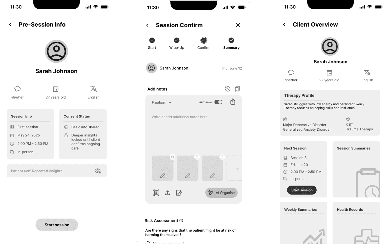
After finalizing the style guide, we refined the screens and created the final designs, along with an interactive click-through prototype for the video.
One of my biggest takeaways from this project was the value of early testing and expert feedback. I am grateful for the support of our professors and the opportunity to collaborate with a licensed therapist, whose insights helped us challenge assumptions and strengthen the final solution. Designing one platform for both clients and therapists taught me how to balance different user needs while creating a cohesive experience and visual identity.