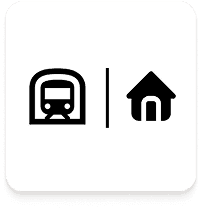
People without a car (7 of 13)
Rely on public transport daily and want more reliable real-time information.
People with a car (6 of 13)
Use public transport less frequently and are frustrated by delays and overcrowding.
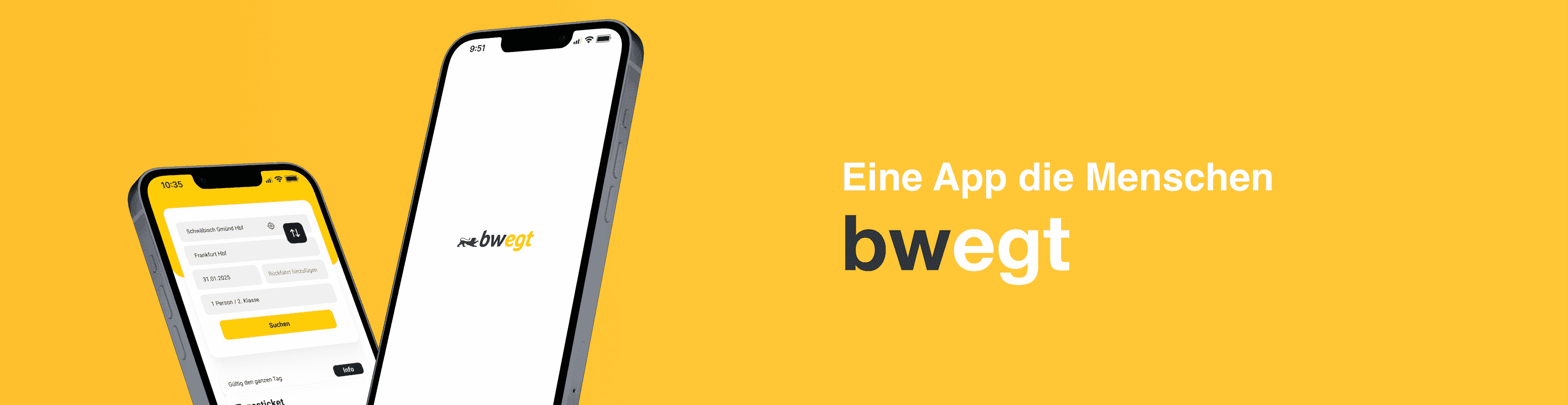
Reimagining the app to make travel more seamless, enjoyable, and efficient
The goal of this project was to reimagine the traveling experience within the bwegt app, improving user engagement, simplifying navigation, and adding key functions to enhance the overall usability.
Our first step was to understand the competitive landscape by analyzing three major competitors: Deutsche Bahn, VVS, and Omio. By identifying their strengths and weaknesses, we could refine our design approach to offer a more compelling user experience.

We conducted 13 qualitative interviews to gain insights into public 10-20 minutes, focused on users' daily travel habits, frustrations, and expectations.
Rely on public transport daily and want more reliable real-time information.
Use public transport less frequently and are frustrated by delays and overcrowding.
Experience delays, broken machines, and limited information.
Prefer buying tickets digitally but struggle with complex fares and technical issues.
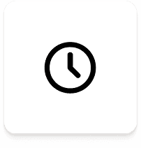
Frequent delays and cancellations create frustration. Users want better real-time updates and clearer communication.
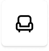
Overcrowding, poor ventilation, and seat availability were the most common complaints.
Rely on public transport daily and want more reliable real-time information.
Use public transport less frequently and are frustrated by delays and overcrowding.
To create a more user-centered design, we developed a persona that represents our target audience and their needs. This persona helped us better understand the challenges and behaviors of a typical public transport user, guiding our design decisions throughout the process.
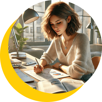
23 | Schwäbisch Gmünd | Psychology Student
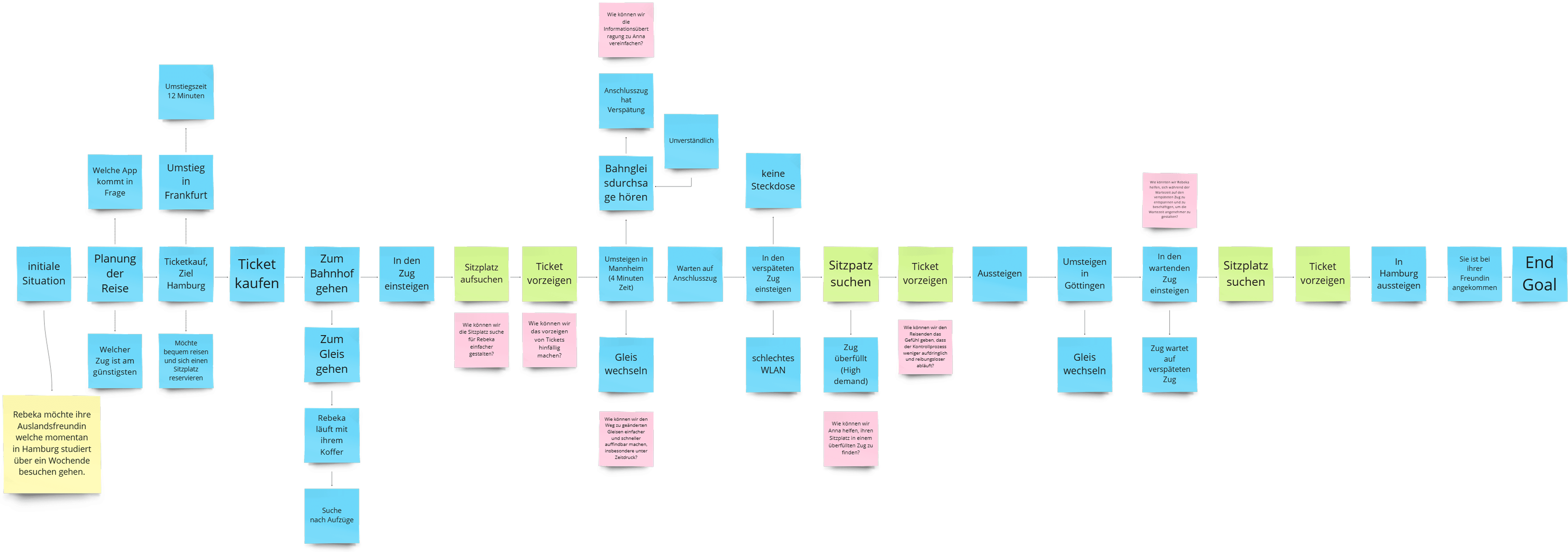
The flow helped us visualize all the different situations a user could encounter during their travels. It allowed us to identify pain points and opportunities for improvement across the entire travel experience, guiding our design decisions.
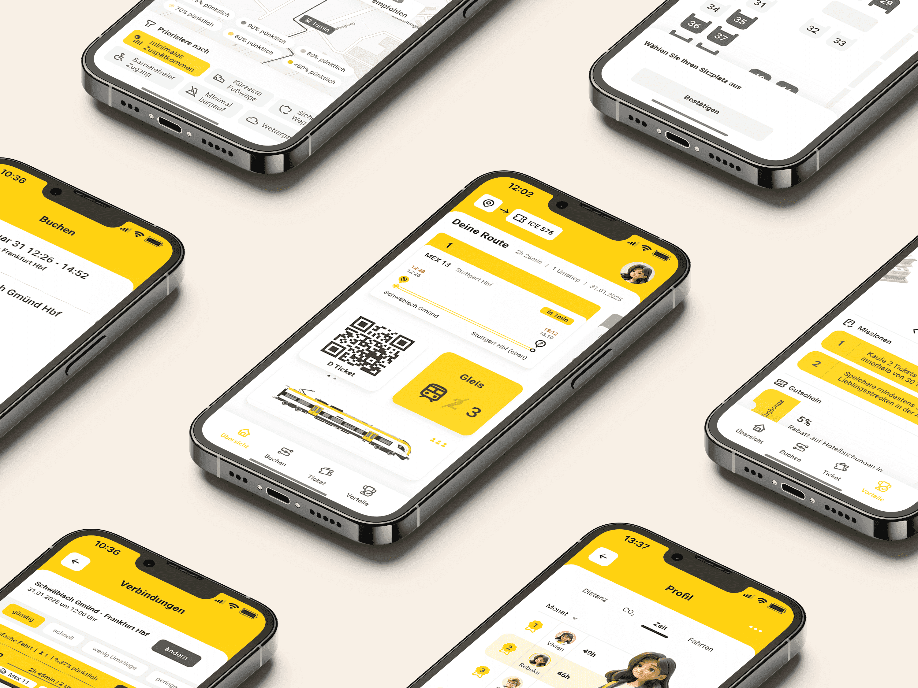
To create our prototype, we started by creating mid-fidelity wireframes on Figma of the key screens the users would be interacting with. This way we could set our priorities of each screen straight and focus on the important functions the user would be looking for.
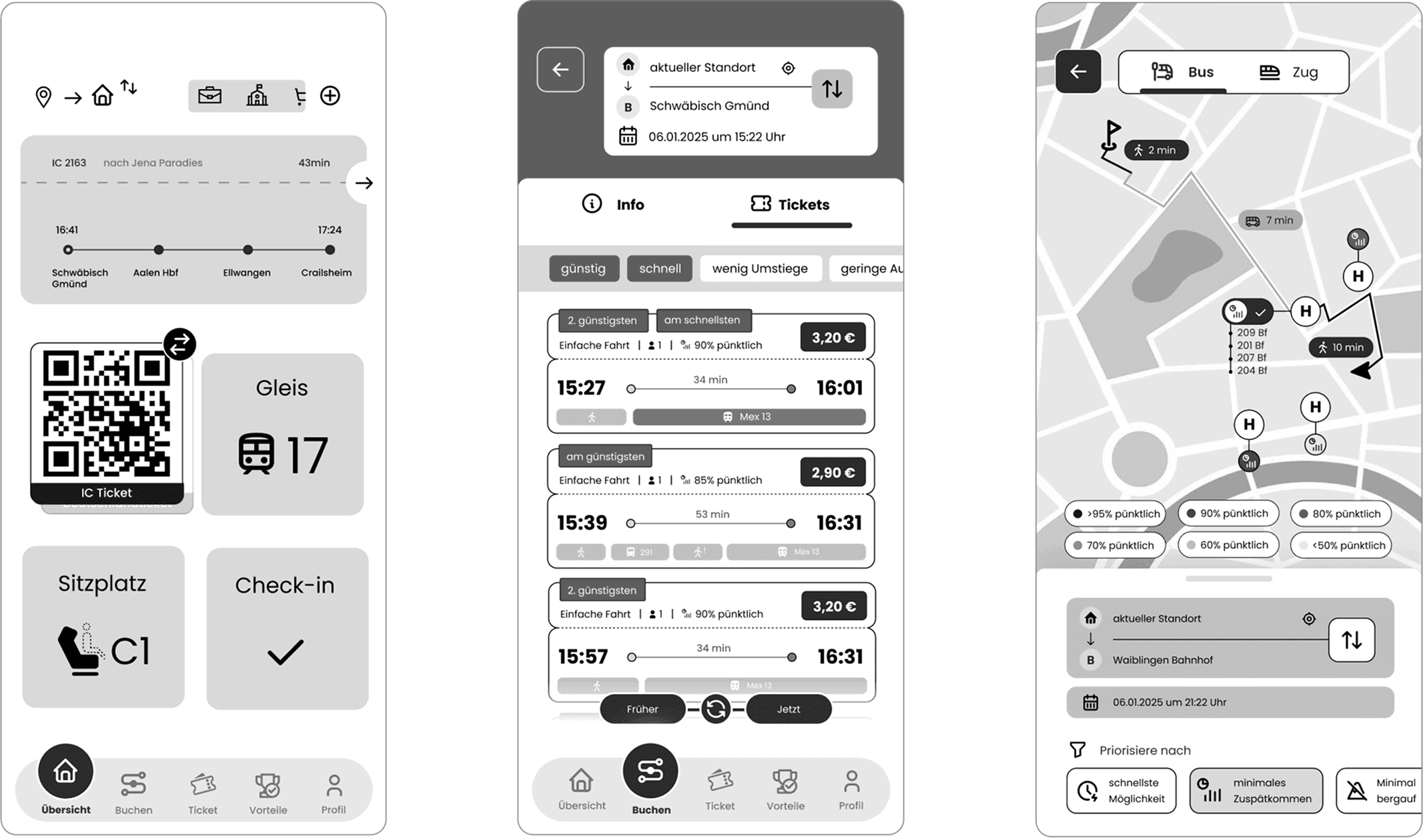
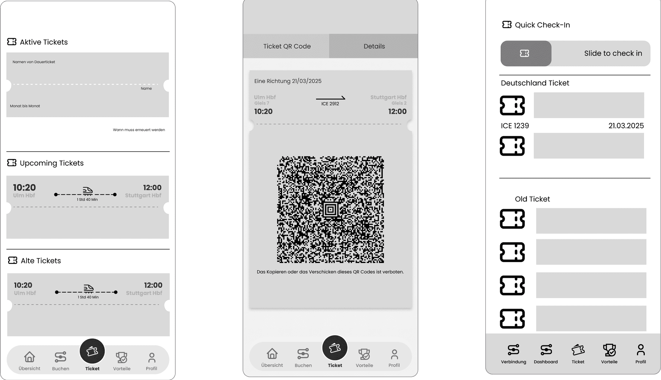
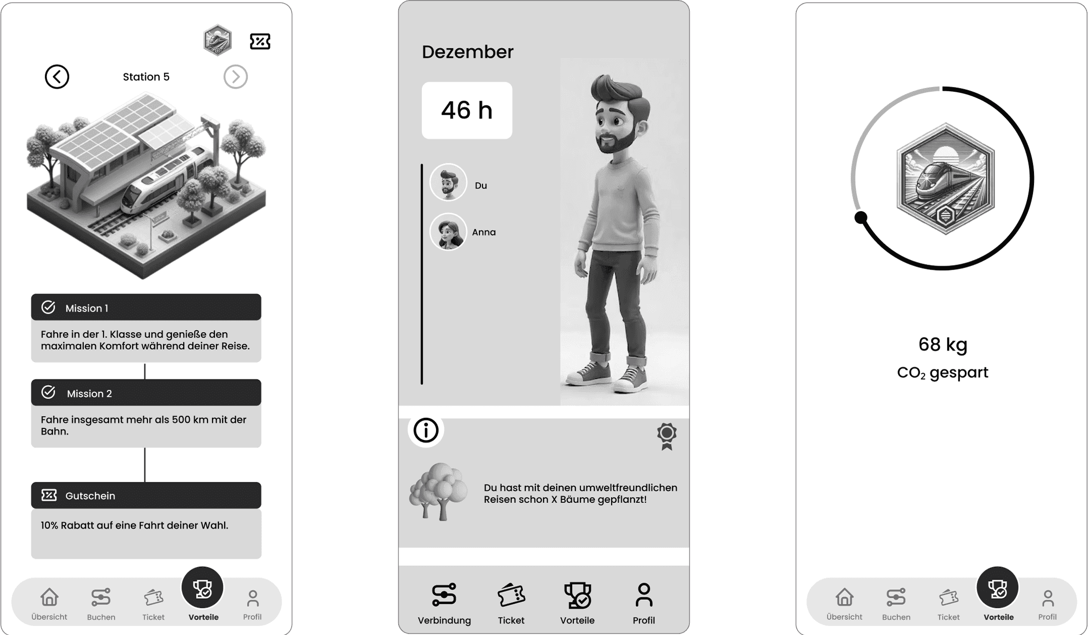
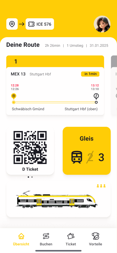
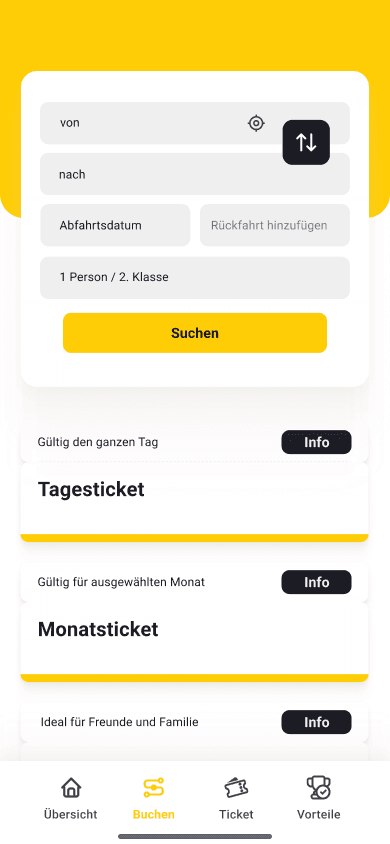
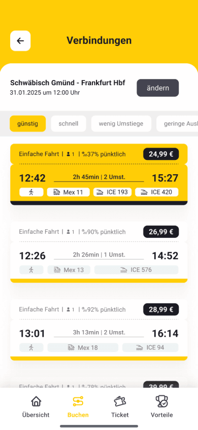
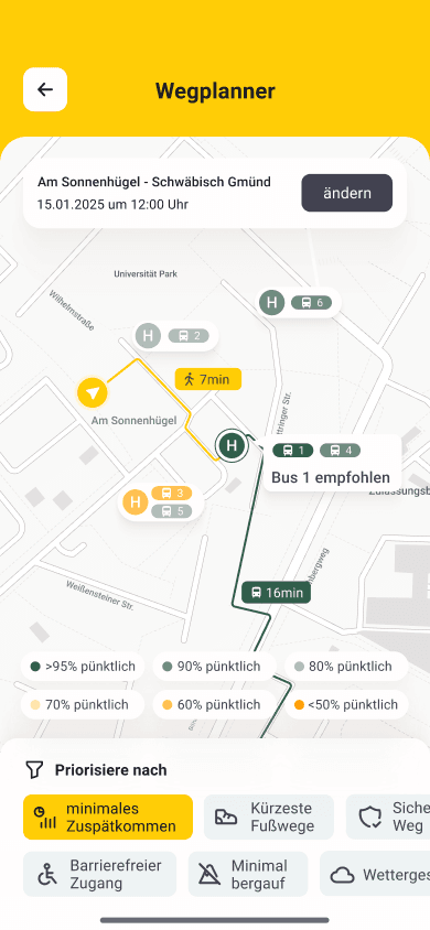
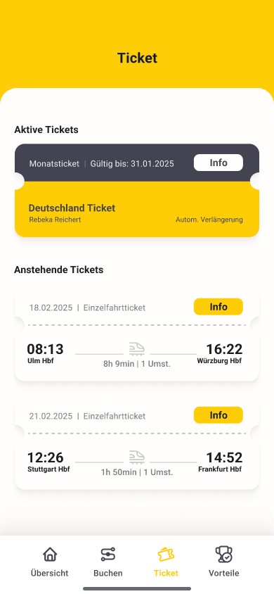
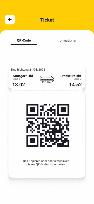
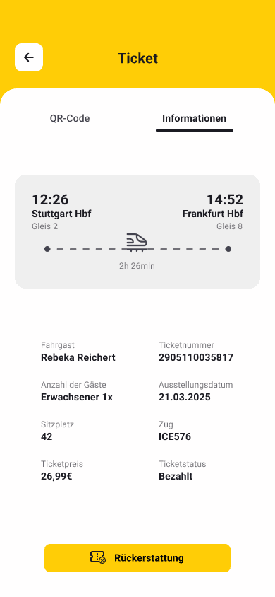
Travel / Route screens
For the bwegt app redesign, we aimed to refine the existing design while staying true to its original branding. Instead of creating an entirely new identity, we adjusted the colors to improve readability, usability, and aesthetics while maintaining brand recognition.
Primary Yellow
#FFCD06Secondary Yellow
#FFF7DBBackground
#FFFFFFText Primary
#1B1B23Text Secondary
#434351We chose Roboto for its modern and highly legible design, ensuring readability across different screen sizes. Its clean, geometric structure complements the app's minimalistic and functional aesthetic while maintaining a friendly and approachable feel.
Aa
Aa
Aa
Aa
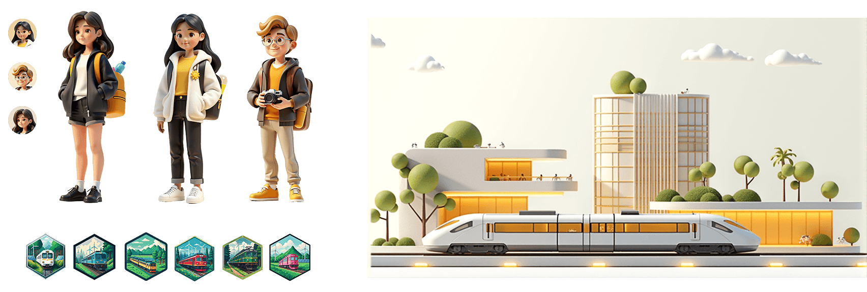
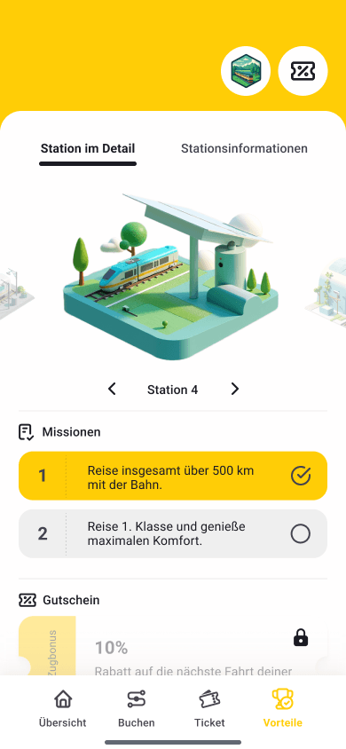
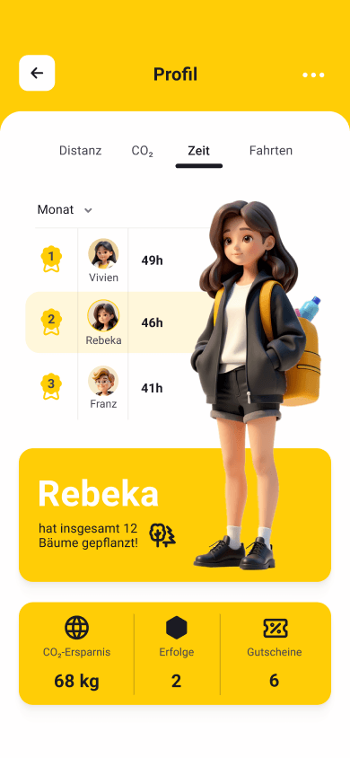
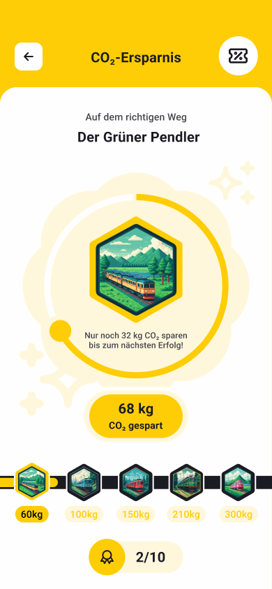
We created 3D characters based on each team member using Stable Diffusion, incorporating yellow accents to align with the app’s branding. The same tool was used for the train stations to maintain visual consistency. For the benefit program, CO₂ savings badges were generated in a pixel art style with Gemini, using gamification to track progress and motivate users.
After finalizing the style guide, we refined the screens and created the final designs, along with an interactive click-through prototype for the video.
For mobile, we prioritized quick access to key information, catering to commuters with easy access to schedules, routes, and notifications for a seamless on-the-go experience.
The bwegt app redesign taught me the value of user-centered design and iterative improvements. Conducting interviews helped me understand real user needs, emphasizing data-driven decisions. I also strengthened my skills in wireframing, usability testing, and refining designs based on feedback.