Reduce smartphone dependency
Minimize distractions from excessive phone usage during shopping.
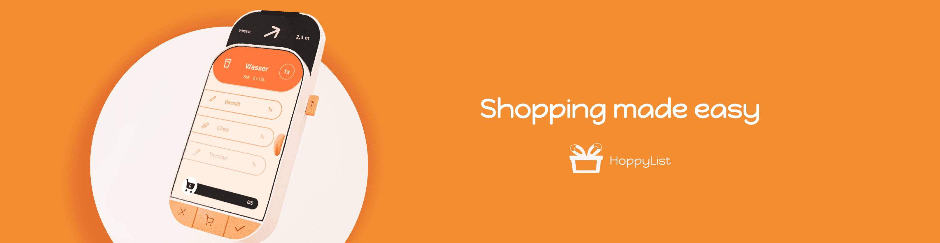
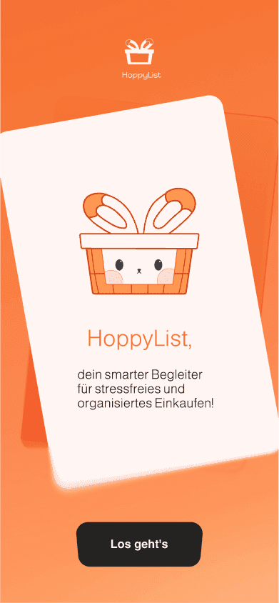
Smart Shopping Assistant concept, designed to support and simplify your shopping experience
The goal for this project is to create a smart, haptic user interface, focusing on "Peripheral Interaction in Daily Life." By designing digital concepts that emphasize touch-based interaction, we aim to improve usability in daily tasks where tactile feedback plays a significant role.
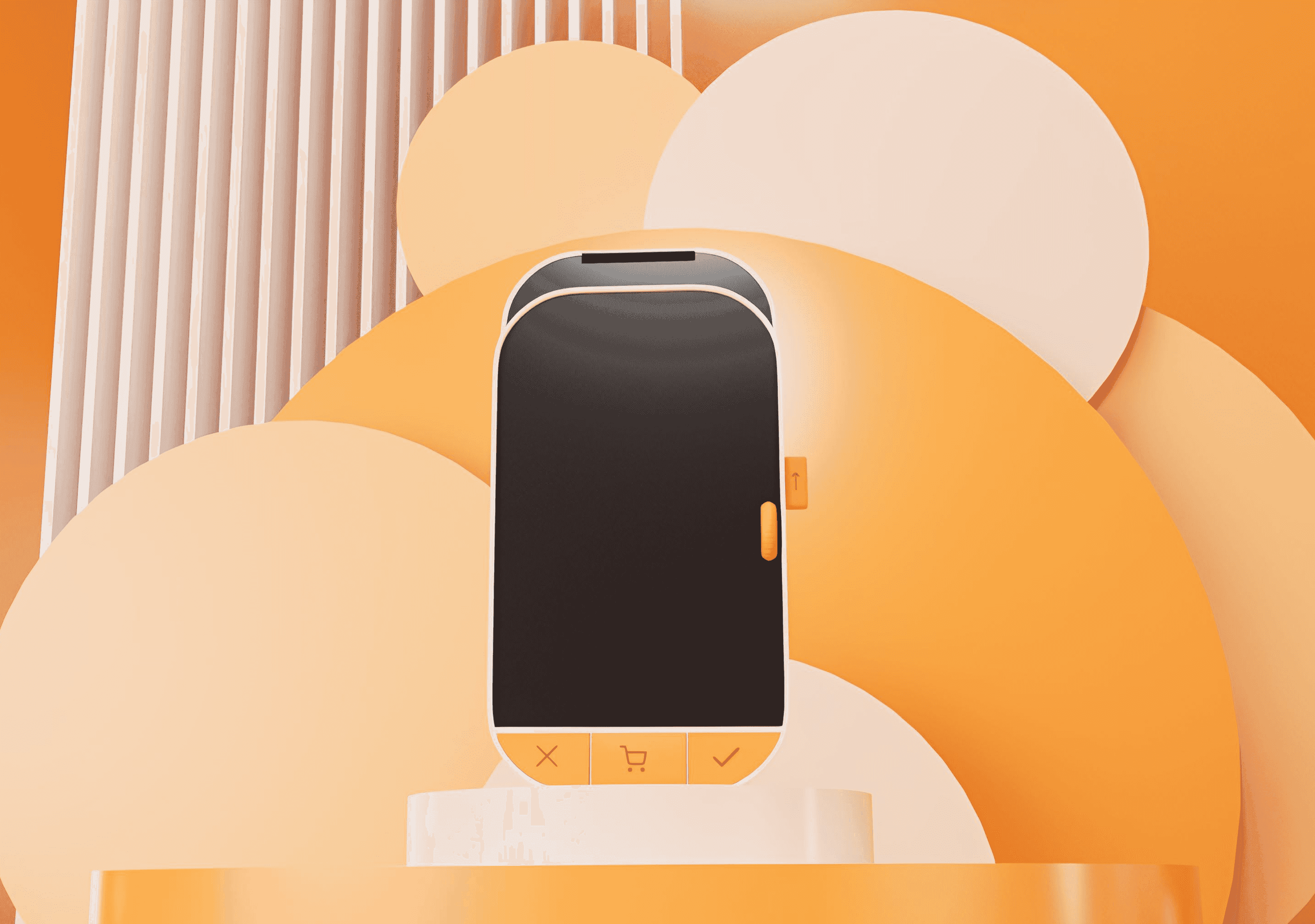
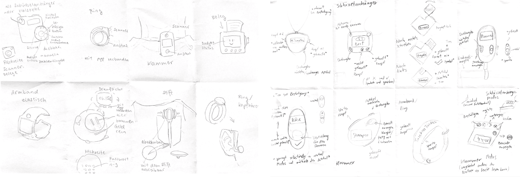
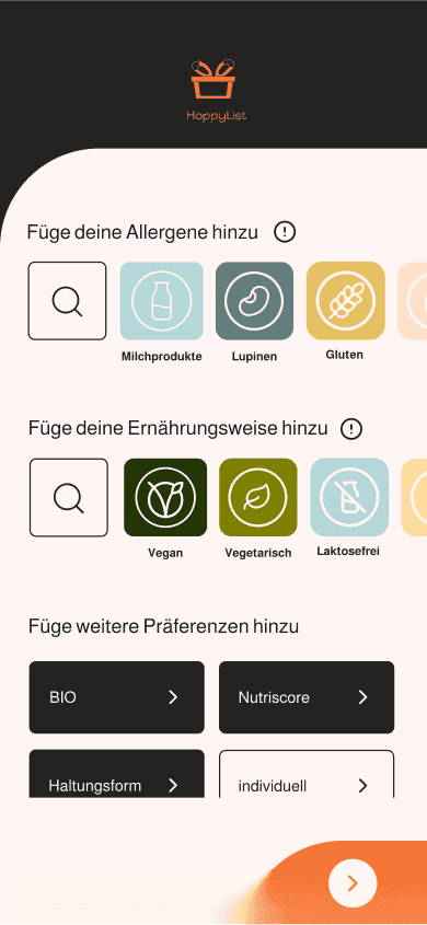
In the first phase of our project, we explored various potential ideas and categorized them into several areas. We identified a few promising directions using the Crazy 8s method, which allowed us to sketch different design concepts and refine our ideas. Ultimately we focused on creating a solution for better organization and chose the concept of a smart shopping list. The device helps users navigate stores, find products, and provides relevant information like allergies or nutritional details.
Our goals were centered around reducing stress, promoting accessibility, and offering a more engaging and hands-free way to shop.
Minimize distractions from excessive phone usage during shopping.
Make shopping a more relaxed and enjoyable activity, especially during stressful or hectic times.
Make the device easy to borrow and use for everyone. Shoppers can simply borrow it and return it after they're done.
Provide auditory and tactile feedback, allowing users to interact with the device without needing to constantly look at it.
The user flow was a key aspect of our device, as it aims to provide a service that supports the entire shopping process. Every function was designed with the user flow in mind to ensure a seamless and stress-free shopping experience.
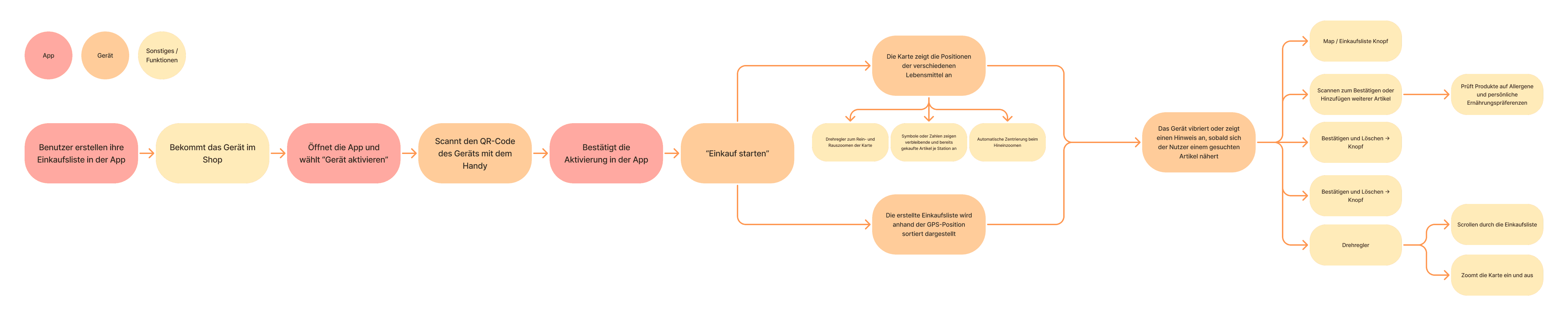
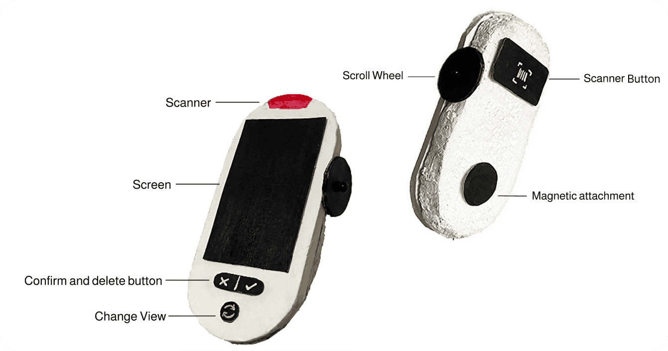
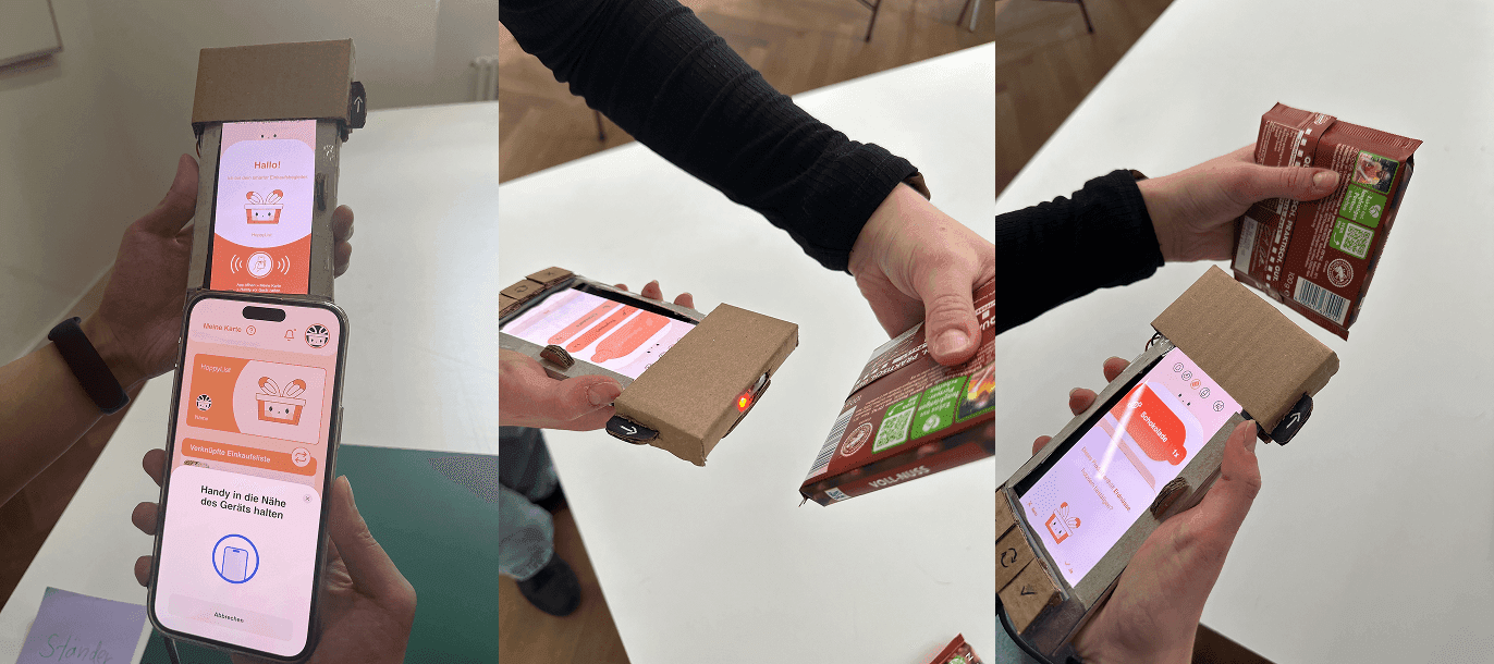
We began by creating low-fidelity wireframes to visualize the basic layout and interaction flow of the device. Then we built a simple physical prototype, paying attention to ergonomics, the size and button placement to ensure a pleasant user experience.
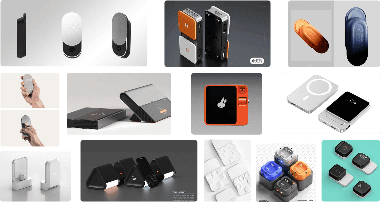
To define the tone and visual language of our product, we created a moodboard. We explored visual inspiration, color schemes, and device aesthetics, aiming for a design that is both functional and approachable.
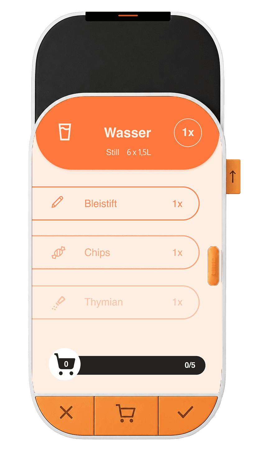
We aimed to create a stronger visual presence. By adjusting the design to make it stand out more and easier to handle, ensuring it better fits the user’s needs. After experimenting with different color combinations, we decided on orange for the interactive elements to ensure visibility.
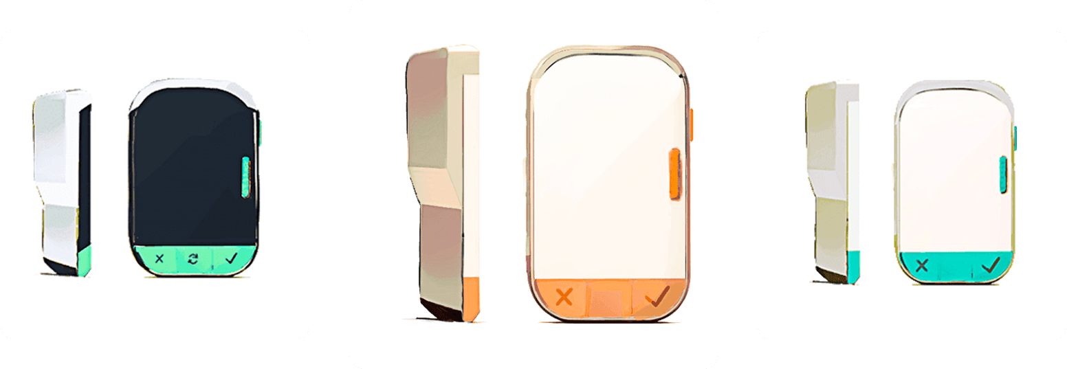
Our color palette centers around bright orange for key elements, supported by white and black for clarity and contrast. This ensures a friendly and focused interface.
Primary
#FE9751Accent
#FFD8CDBackground
#FFFFFFSecondary Elements
#252321Sharing Highlight
#A5BADBFor the interface, we selected Almarai for its clean, modern design, ensuring readability and a professional appearance across the device and app.
Aa
Aa
Aa
For the logo, we chose the "Happy Monkey" font to convey a playful, approachable vibe, aligning with the friendly mascot.
Ag
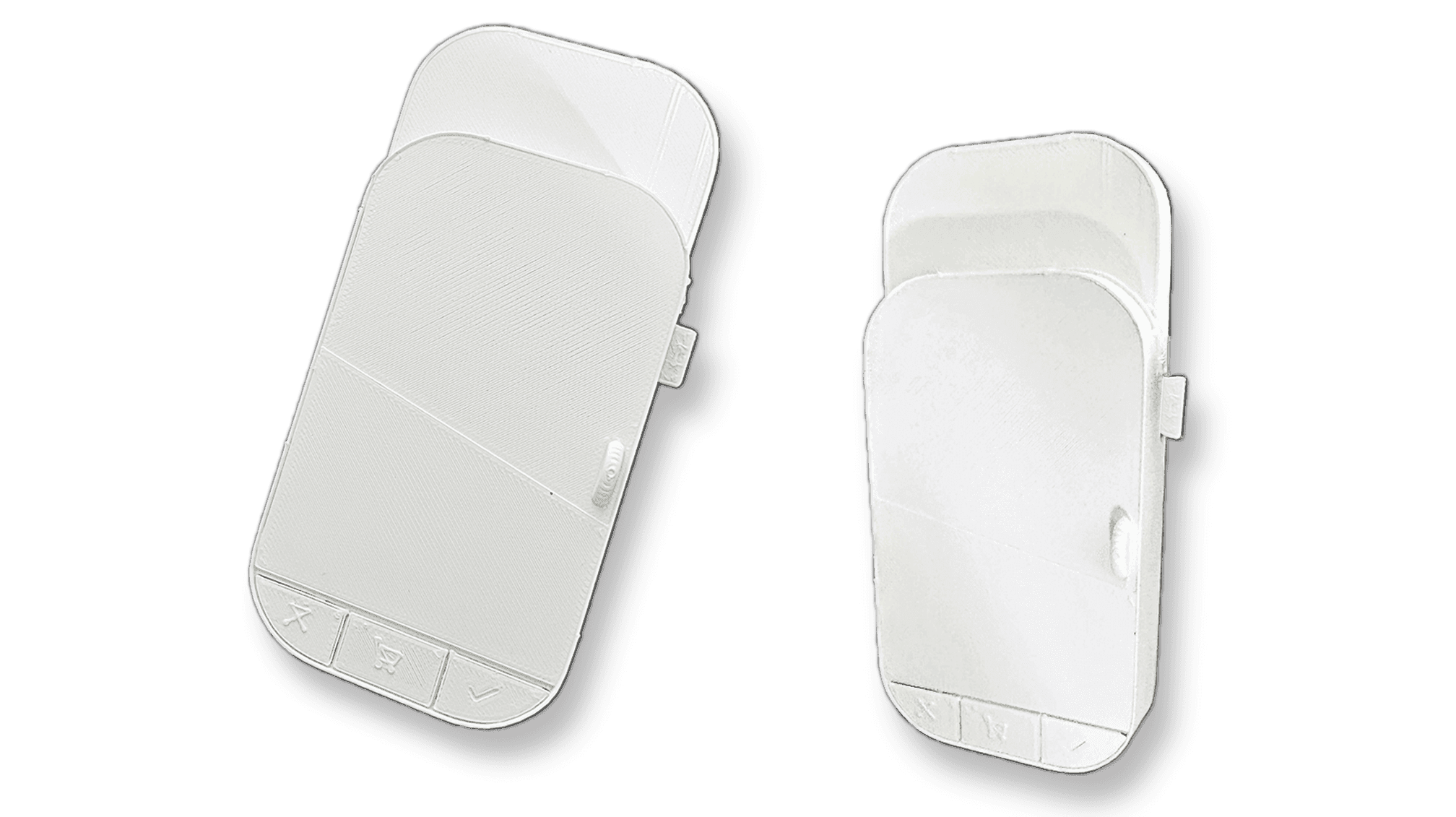
We decided to print a 3D model of our device. Which allowed us to better visualize the final product, providing a more accurate representation of its size, shape, and ergonomics.
We conducted 6 usability tests with the functional prototype and its associated app. Participants were particularly confused when using the product scanner, as its affordance was unclear, and they didn’t understand how or why to scan products. In contrast, the arrow navigation was well-understood and generally received positive feedback.
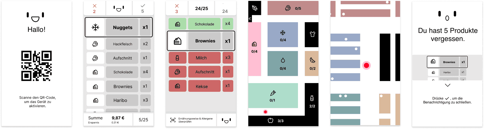
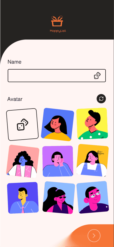
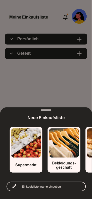
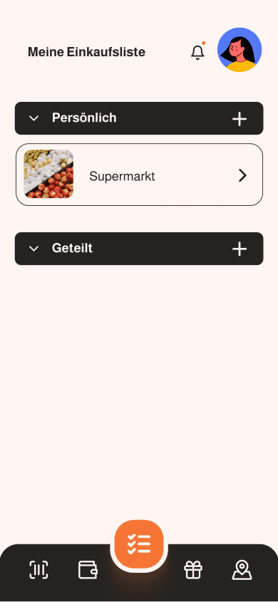
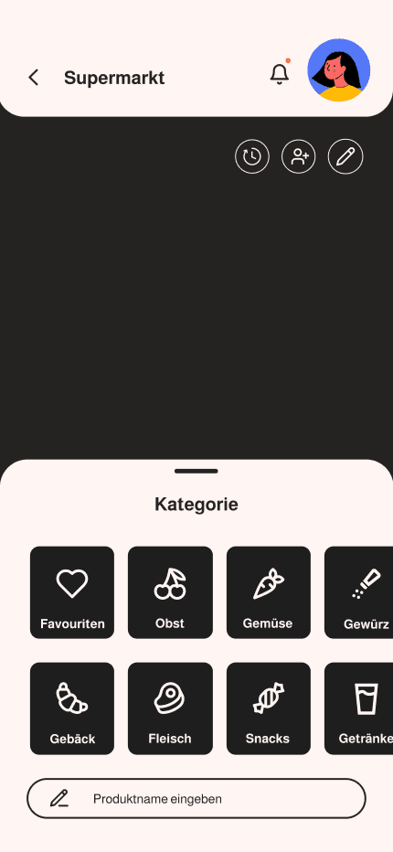
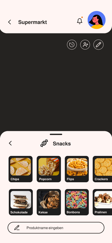
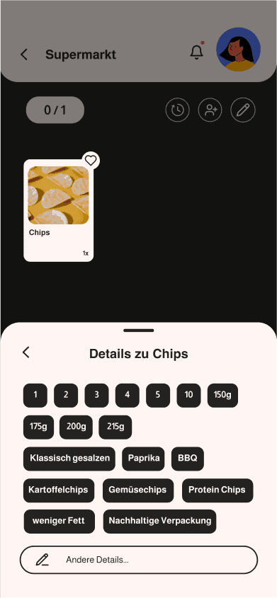
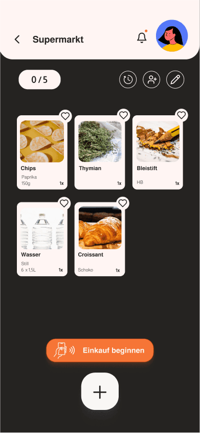
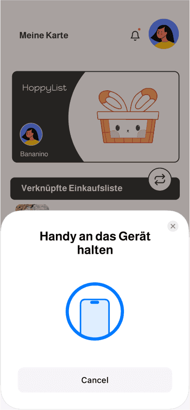
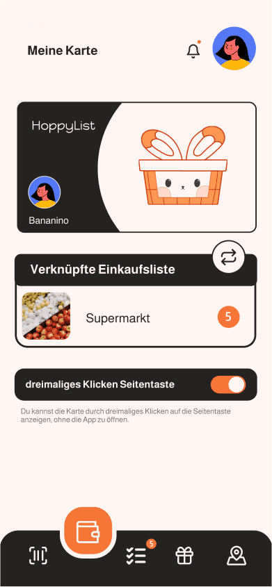
Here are the key screens of the HoppyList app that provide an easy-to-follow journey, from creating an account and setting personal preferences, to building a shopping list and linking the app with the device in the store.
This project taught me the importance of combining functional design with user experience. Usability testing highlighted areas for improvement, and I learned how essential it is to iterate based on real user feedback. I also developed my skills in prototyping and refining designs to ensure a seamless user flow.